'Who we are and what we're about...'
|
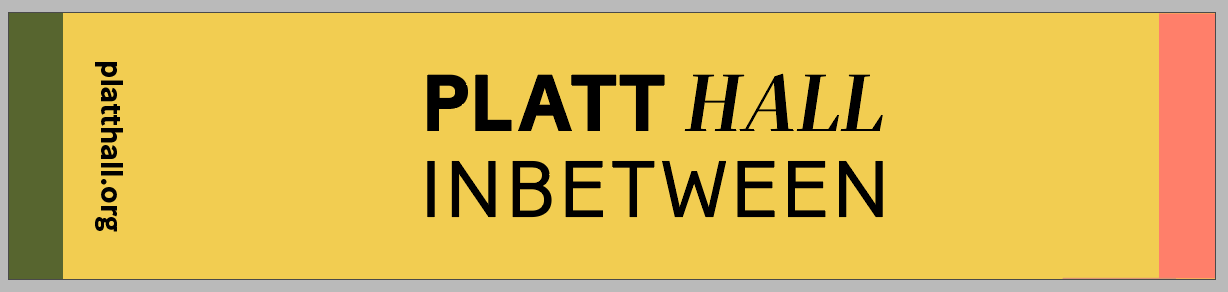
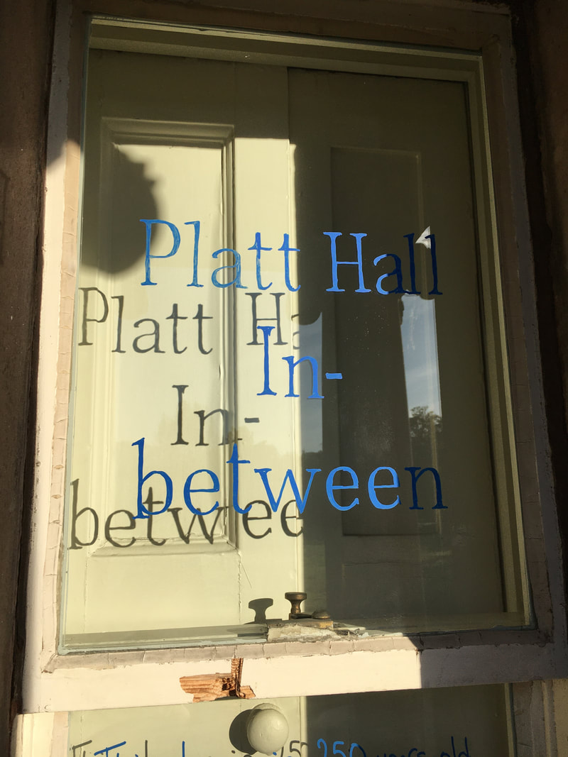
We're really excited to roll out Platt Hall's new Visual Identity, devised by graphic designer Ty Abiodun, in collaboration with local residents and the Platt Hall team. It's a key moment for the Inbetween project, the first time in the Hall's history as a public building that it has had its own visual 'voice', and our most profound bit of collective decision-making in the project so far.
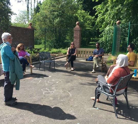
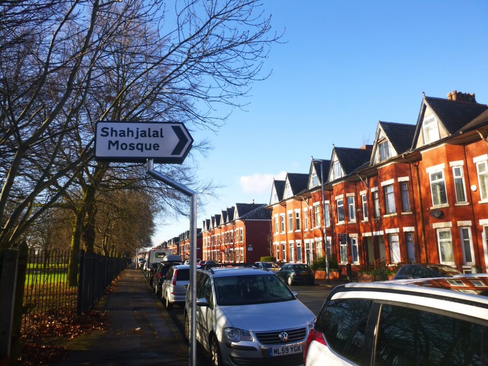
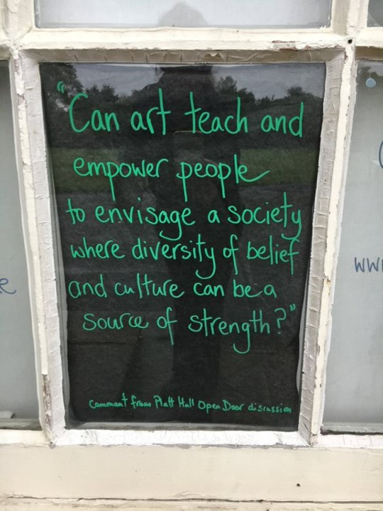
Over the summer of 2021, a working group of 10 people, made up of residents, partners and staff, spent time reflecting on what branding is and does. We considered the particular context of Platt Hall - the history of the building and collections, the multiple cultures and communities that surround it, and the wider environment of the park and streets in which they all sit. We considered the messages we wanted to communicate, the people we wanted to reach, and what challenges that might involve. And all within the restrictions of working with a listed building. |
|
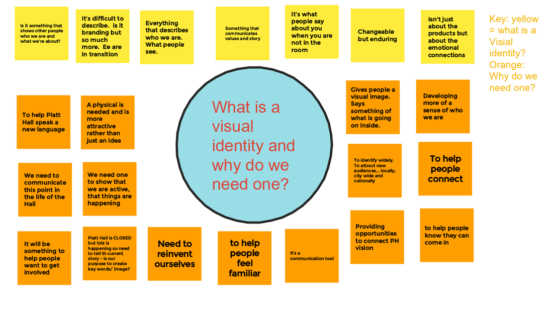
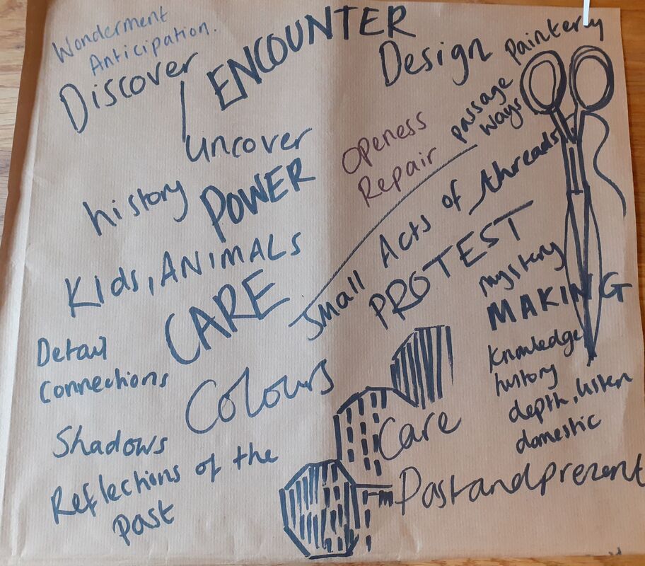


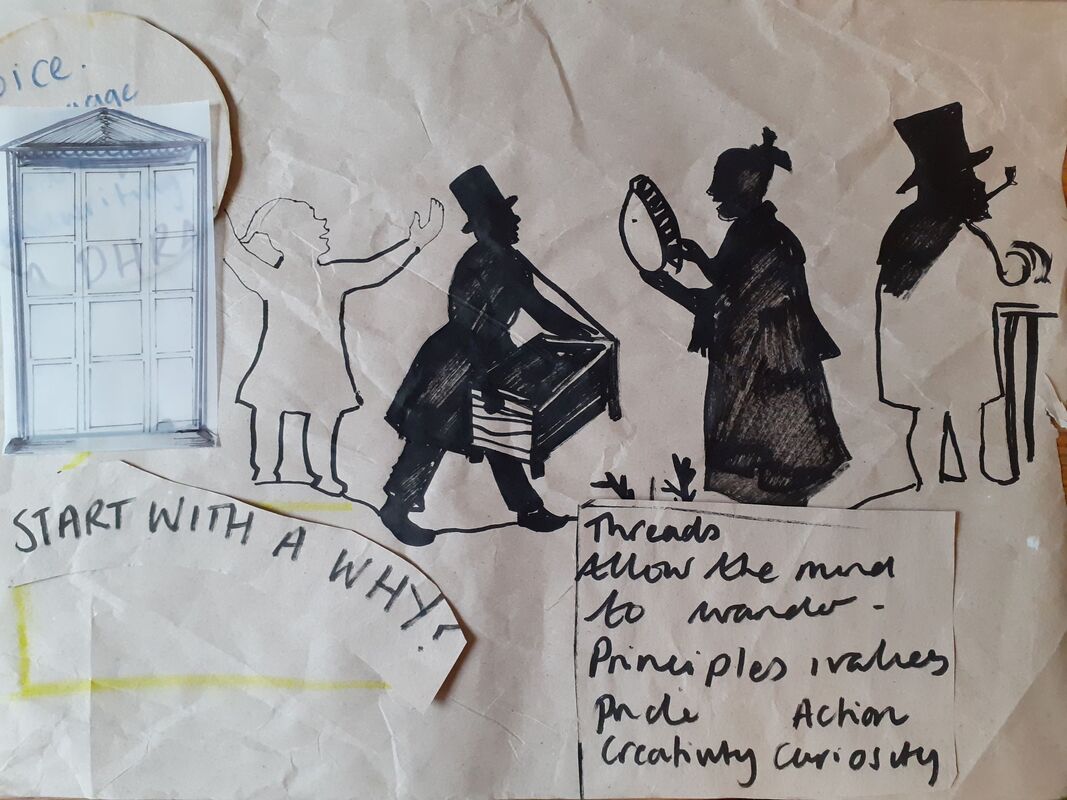

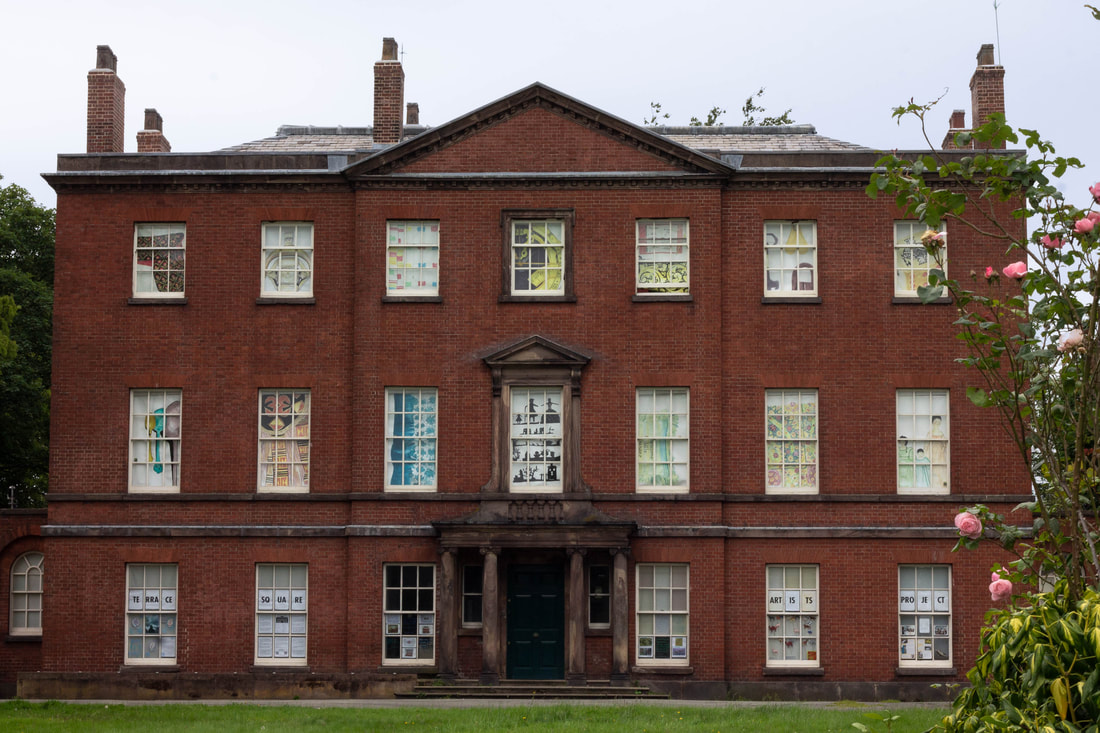
Over several weeks of group discussion and creative workshopping, we arrived at the guiding principle of 'elegant disruption'. Our aim was to retain a visual sympathy with the aesthetic harmony of the building but also to unsettle the connotations of historical privilege and exclusivity that come with it.
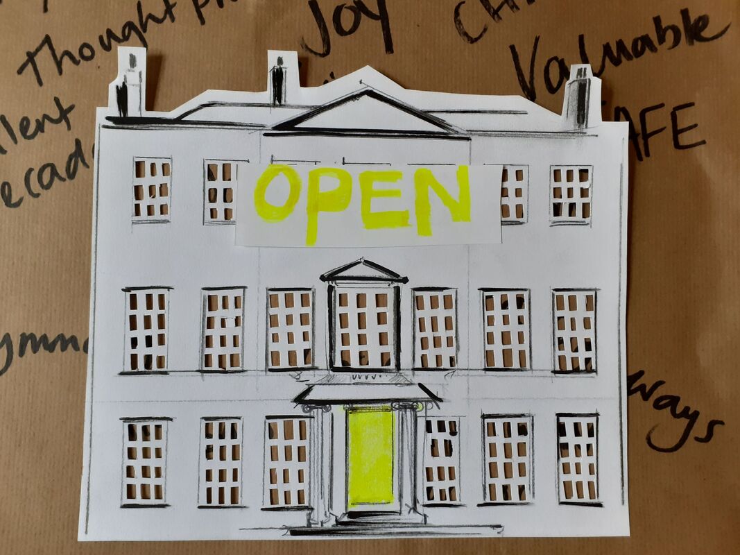
The end result intentionally avoids overtly 'heritage' style design, in favour of something we hope is joyful, clear and simple to understand.
It plays with the principle of threes - three parts to the building, three Manchester wards that surround it, three words in the project title, and three elements of time - past, present and future. The colour palette is bright and cheerful, with echoes of the building, park and wider streets. The language is simple and to-the-point, and the mix of serif and san serif typeface combines classical and contemporary styles.
We'll be rolling out different applications of these elements over the coming year. Of course, it's not just about logos and typeface. As the workshops revealed, it's about the emotional connections, the values and stories that inform everything we do. But now we have some basic ingredients that will help us tell those stories as effectively as possible.